Brand Identity · Food Delivery · 2026
Mangio
a Casa
The Brief
Mangio a Casa didn't want to be just another interchangeable delivery app. So they needed a brand identity that breathes Italian cinema heritage while still feeling modern and appetizing, on the phone screen just as much as on the box at the door.
The Approach
The logo quotes the visual language of classic Italian film posters, stripped down and confident, without tipping into museum-piece territory. I made the red and green of the Italian flag bolder and warmer, with a twist instead of the expected nostalgia cliché. The brand works on every screen without hiding its Italian roots.
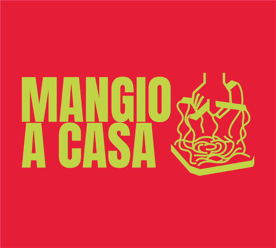 Logo & WordmarkCinema-inspired typography
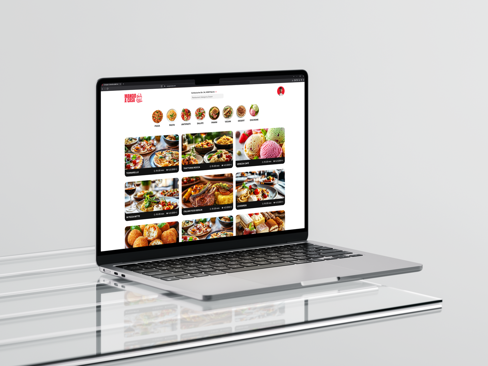 WebsiteOnline ordering
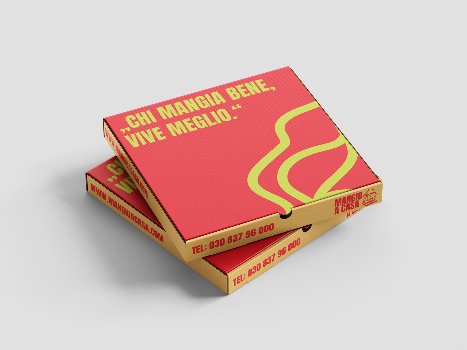 PackagingBoxes, bags, delivery material
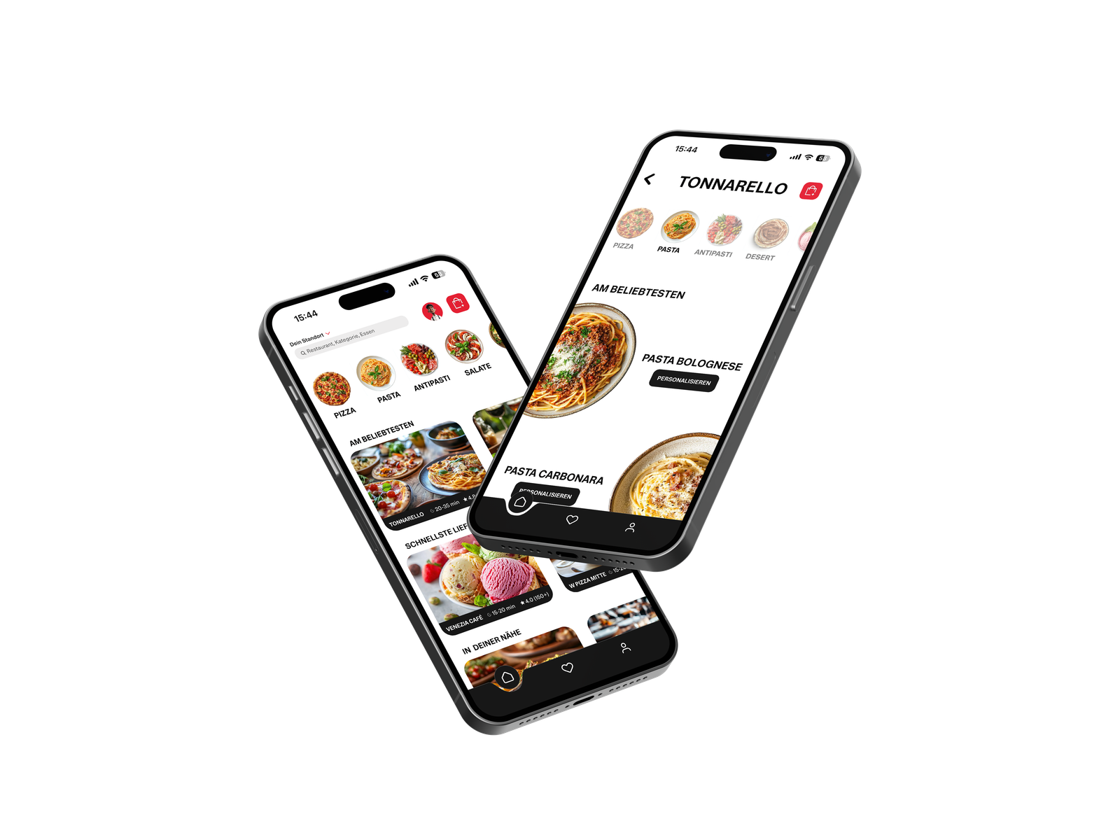 AppOrdering on the phone
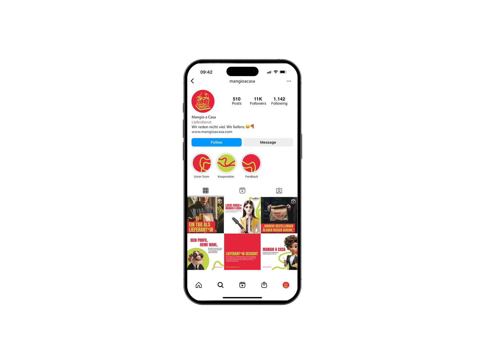 InstagramSocial media presence
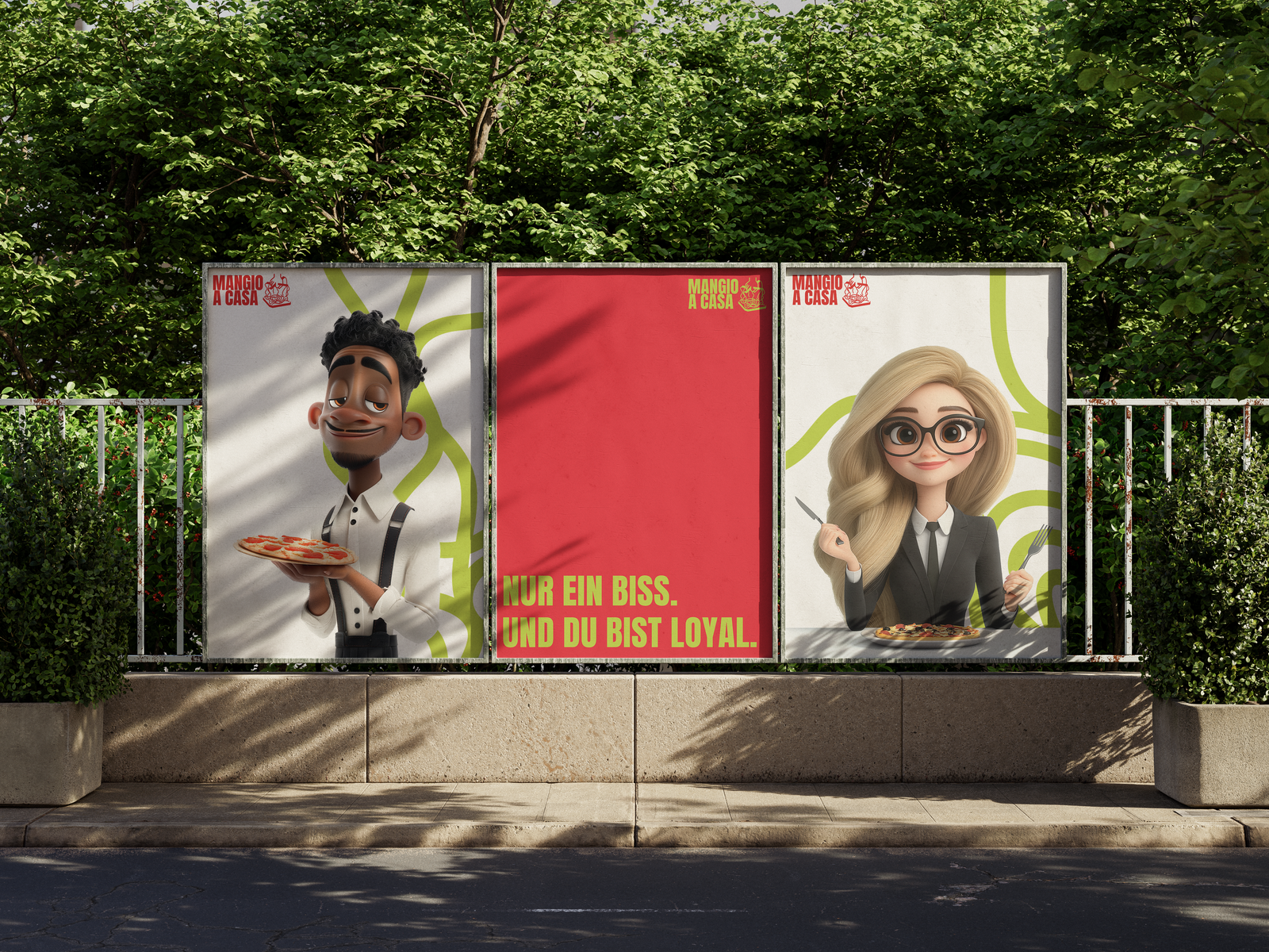 Poster CampaignOut-of-home
"Mangio a Casa" means eating at home like you're at the movies, with visuals you feel before you even read them.
Concept & Execution, Chiaro Creative